The Burchfield Penney Art Center: Art Gallery visit # 2 (11/10/12)
Step 1: The Exhibition
Questions about the exhibit:
1. What is the title of the exhibit?
There were a few exhibits being shown here, such as "Spain: Rock, Roll, Rumbles, Rebels & Revolution", and "McCallum Tarry: Intersections".
2. What is the theme of the exhibition?
The main theme seemed to be Martin Luther King Jr., and a lot of racially charged art in the advertised exhibits.
Step 2: The Gallery
Questions about the physical space:
1. What type of lighting is used?
The lighting was mainly recessed, and significantly dim considering it was a gallery. Obviously there were spot lights where needed to help emphasize art.
2. What colors are used on the walls?
The gallery is primarily all white, some areas of the art center was grey and dark grey.
3. What materials are used in the interior architecture of the space?
There were light colored hard wood floors, black base boards, which brought out the primarily white walls. Very typical white paint on drywall art gallery scene.
4. How is the movement of the viewer through the gallery space?
Since I had never visited this gallery before, it was sort of like a white maze to me at first, like most other galleries, different rooms lead to different rooms and hallways. Everything was very spaced out, which appeared to me as a way to cleanse the pallet of your mind before moving onto the next piece.
Step 3: The Artwork
Questions about the artwork:
1. How are the artworks organized?
The art was perfectly spaced out, and there was enough space between them where you could definitely concentrate on one piece without having you eyes want to wander to what was next.
2. How are the artworks similar?
They had close to matching frames, and similar matte was used.
3. How are the artworks different?
Every piece of art is different! Thats the beauty of it, other that the themed exhibits, once you move from one piece of art to the next, it was 100% different than the one before it.
4. How are the artworks framed?
There was large mattes used for the most part (unless a huge oil on canvas piece), and the frames used were primarily golds, blacks, silvers, and woods.
5. How are the artworks identified and labeled?
There were the generic white index cards with a black matte behind it to show professionalization and consistency.
6. What is the proximity of the artwork to each other?
There was usually about 2-3 feet between artworks horizontally, then were obviously mounted closer together if there were more than one piece to go together to make one final artwork.
Step 4: Art Criticism Exercise
Select three of the artworks from the show and use the Art Criticism worksheet to desribe, analyze, bracket and interpret the work using the 5-step Art Criticism Process described.
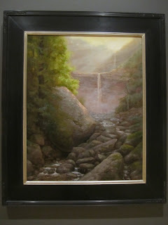
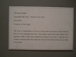
1) The artist is Thomas Kegler, the title is "Kaaterskill Falls Dawn" from 2011. The media is oil on linen. The size is not listed but was about 3ftX2ft. The piece caught my eye immediately, it is a beautiful painting of a waterfall at sunrise. The elements used are, color, texture, rhythm, and form(s). Since there is a proverb listed after the title, I'm assuming the artist was trying to show a scene depicted in the bible.
2) The artist is Charles E. Burchfield, from (1893-1967). The first is called "Ulrich's Envelope from June 8th, 1964, while the other two are 'Untitled'. The media was graphite on commercially printed paper/envelopes. The size is obviously average size business envelopes. The elements used are, form, emphasis, and rhythm. This piece reminded me of what my mother does while she is on the phone...doodles on envelopes laying on the table. Some pieces of art really amaze me that they are considered something special, because in a lot of cases, something like this is done one a daily/weekly basis by someone who knows nothing of art.
3) This again, is a piece by Charles E. Burchfield, from (1893-1967). It is titled "Solitude" from 1918, and is watercolor and charcoal on paper. The size was quite large, unlisted, but about 4ftX3ft. This piece attracted me because I love staring into different landscape pieces, trying to see everything at once, and think about the motive behind it. The elements used are, proportion, rhythm, and forms. This piece at first reminded me of a still scene that may have been painted after the lord of the rings series. The landscape is similar to what is explained in the books and movies. Showing caves, and cliffs with who knows what is above or behind them. Judging by the title of the piece, I would say the artist was trying to convey a simple sense of solitude, or serenity...maybe thinking that everyone needs to get away every once and a while, and appreciate nature.
Take some pictures (no flash) if it is accepted at the Gallery you are visiting.
Bring home brochures and other materials for reference.
4. Answer this question: What did you think of visiting the Gallery and purposefully looking at the exhibition from a different perspective - the physical space, the architecture, theme, etc.?
Looking at the gallery from the standpoint of concentrating on the space as a whole instead of just pieces of art inside of the gallery made me think at first, how huge of a building this is, and SO much open space. With how plain the walls and floors are I definitely realized that it is purposely made to emphasize the art, opposite of what this assignment is asking, so that you DON'T concentrate on other things such as the architecture, and physical appearance of the space. This gallery I think I actually liked a little more than Albright Knox, it is smaller, and the staff was very nice and helpful. It brings a bit of a modern theme to the art gallery, (the entrance way).


No comments:
Post a Comment